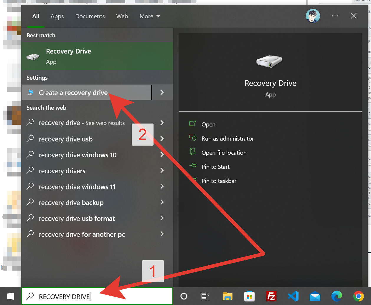
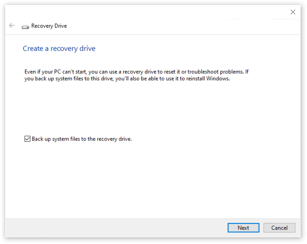
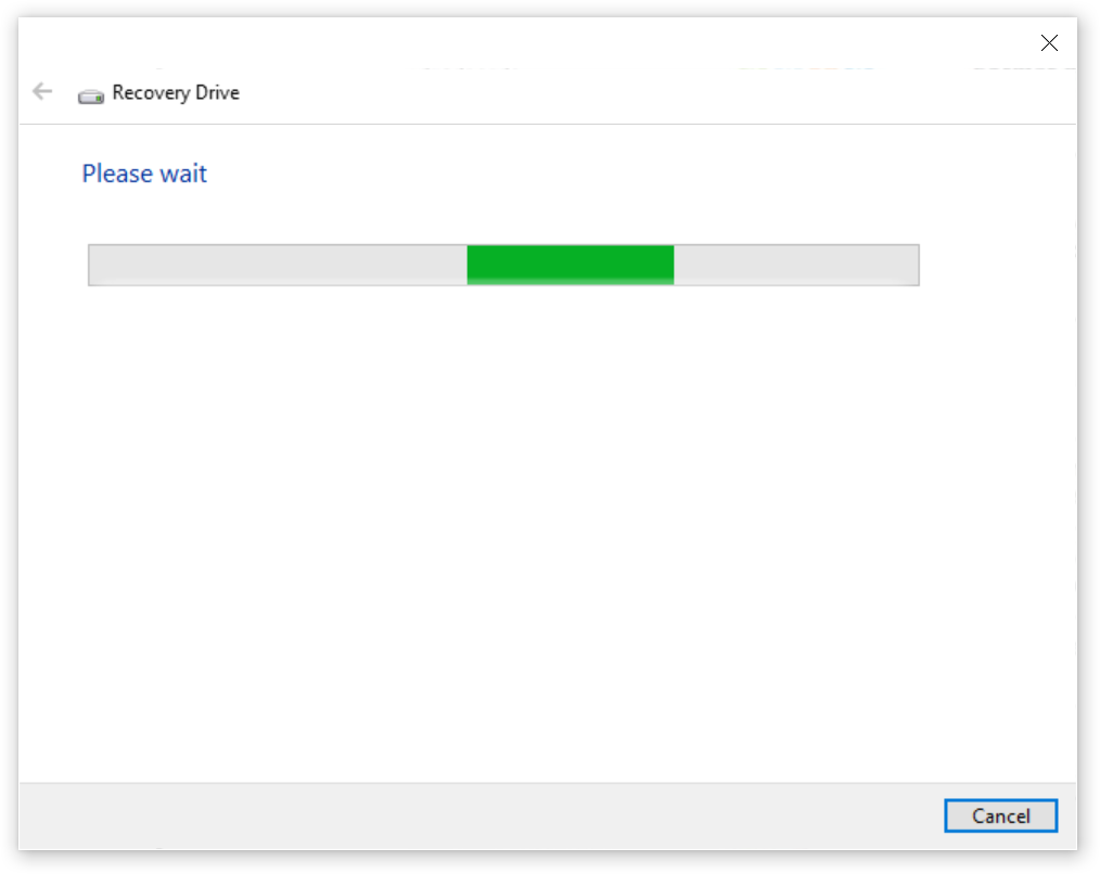
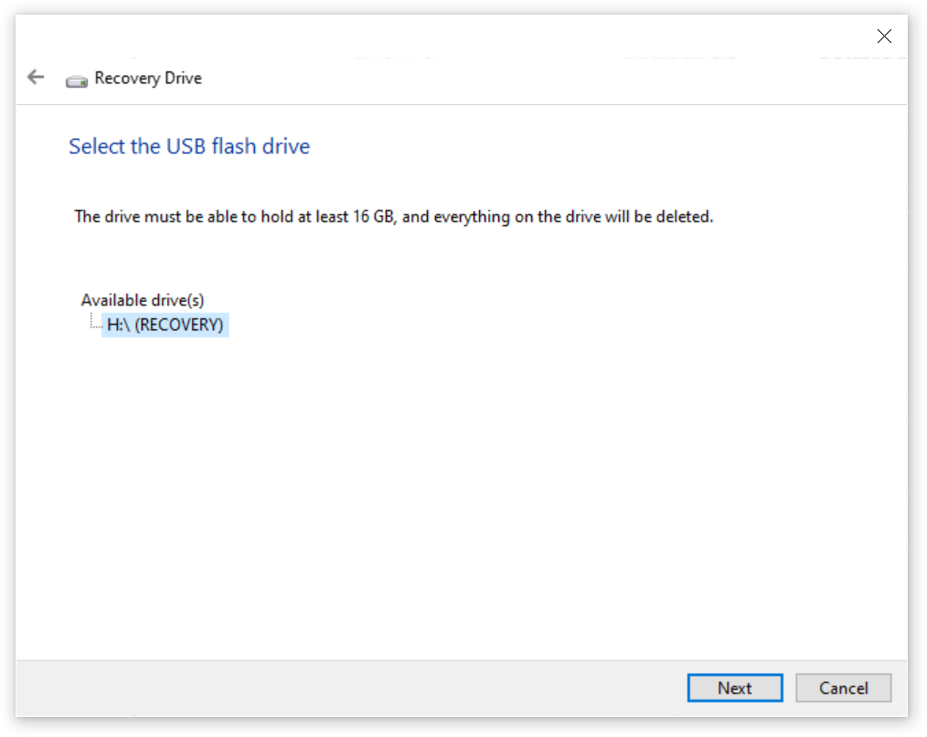
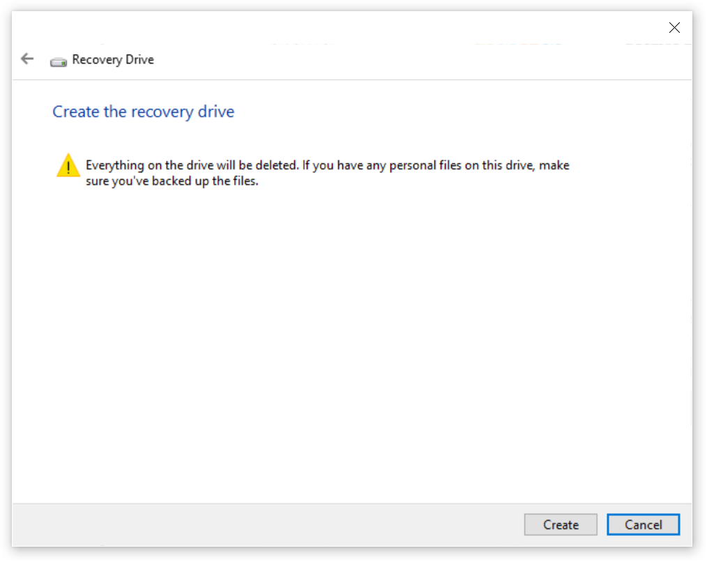
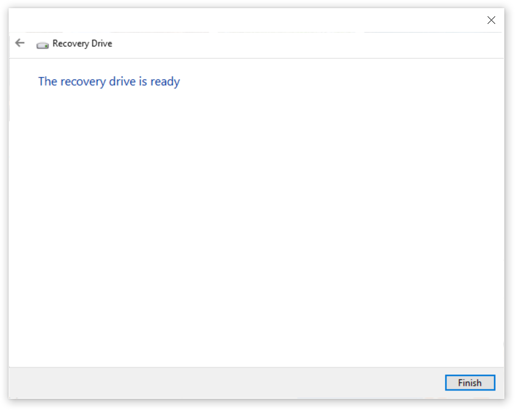
Create RECOVERY DRIVE [USB3 STICK 16GB] Windows 10 Pro [19043.2006]
Time complete: ~90 min
Just another WordPress site
https://getbootstrap.com/docs/5.1/components/popovers/
http://michaeleliasphotovoltaicsystems.com/products.php
                    <div class="justify-content-md-center">
                        <h1 class="text-center spacer_bottom">LUXOR SOLAR - Solar Panels</h1>

                        <div class="row justify-content-md-center">
                            <div class="col-xxl-6 col-xl-6 col-lg-6 col-md-12 col-sm-12 col-12">
                                <button id="myPopover1" type="button" class="btn btn-secondary" data-bs-container="body" data-bs-toggle="popover" data-bs-placement="top" >
                                    <img style="max-height: 1000px; height: 100%;" class="img-fluid" src="https://clients2021.s3.eu-central-1.amazonaws.com/Solar/assets/images/JPGs/Solar-Panels/Solar-Panel_LUXOR_Eco_Line_HC_M120_FB_365-385W_166cs-1.jpg" alt="Solar-Panel_LUXOR_Eco_Line_HC_M120_FB_365-385W_166cs" />
                                </button>
                            </div>
                            <div class="col-xxl-6 col-xl-6 col-lg-6 col-md-12 col-sm-12 col-12">
                                <button id="myPopover2" type="button" class="btn btn-secondary" data-bs-container="body" data-bs-toggle="popover" data-bs-placement="top" >
                                    <img style="max-height: 1000px; height: 100%;" class="img-fluid" src="https://clients2021.s3.eu-central-1.amazonaws.com/Solar/assets/images/JPGs/Solar-Panels/Luxor-Solar-Panel-Warramty-LX-PWEX-15plus-EN-1.jpg" alt="Luxor-Solar-Panel-Warramty-LX-PWEX-15plus years" />
                                </button>
                            </div>
                        </div>
                    </div>
<!--===== script start =====-->
<script src="assets/js/jquery.min.js"></script>
<script src="assets/js/popper.min.js"></script>
<script src="assets/js/bootstrap.min.js"></script>
<script>
$(document).ready(function(){
$("#myPopover1").popover({
title: '<h6 class="custom-title"><i class="bi-info-circle-fill"></i> LUXOR SOLAR More info</h6>',
content: '<div><a target="_blank" href="/LX_EL_HC_M120_340-360W_1684x1002x35_SF_158cs_en_low.pdf">Link Doc PDF</a> - <a target="_blank" href="https://www.luxor.solar/en/index-en.html">Luxor Web-Site</a></div>',
html: true
});
$("#myPopover2").popover({
title: '<h6 class="custom-title"><i class="bi-info-circle-fill"></i> LUXOR SOLAR More info</h6>',
content: '<div><a target="_blank" href="/LX-PWEX-15plus-EN.pdf">Link Doc PDF</a> - <a target="_blank" href="https://www.luxor.solar/en/index-en.html">Luxor Web-Site</a></div>',
html: true
});
});
</script>
========================
The below Tutorial worked and was tested with Bootstrap 5.0.2 – SUCCESS.
https://getbootstrap.com/docs/5.1/getting-started/download/
I implemented it in Production here: http://www.michaeleliasphotovoltaicsystems.com/projects.php
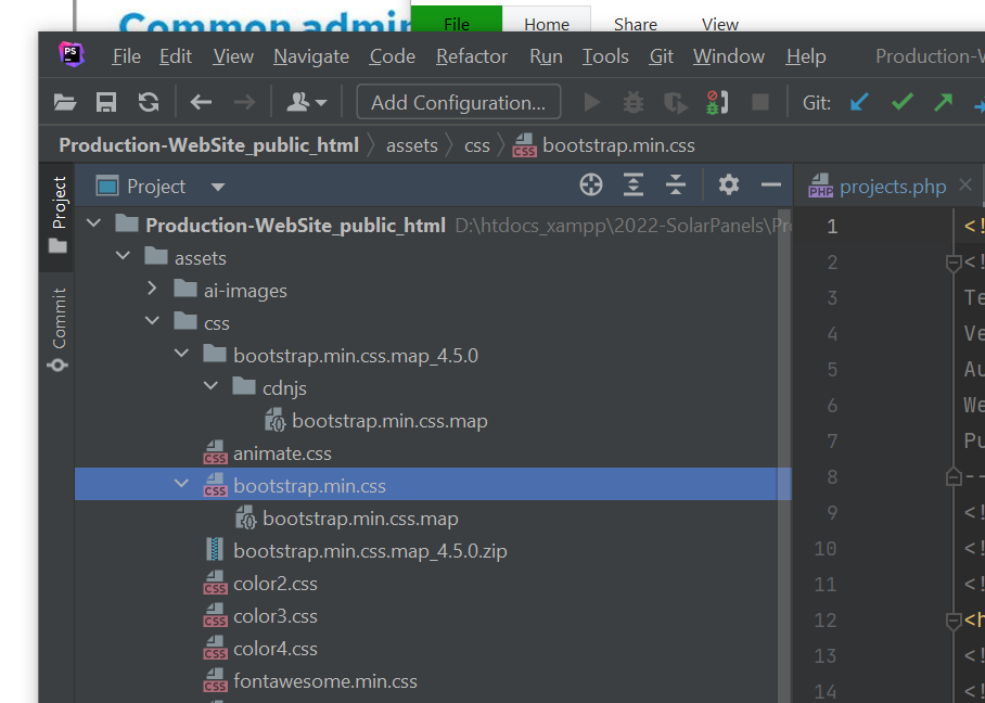
Note: FOUND A DIFFICULTY BUT – Got Error in Browser Console – SOLVED BY DOWNLOADING: bootstrap.min.css.map from
https://www.cdnpkg.com/twitter-bootstrap/file/bootstrap.min.css.map/
AND PUT IN THE SAME FOLDER AS \assets\css\bootstrap.min.css >>>>
JUST 4-STEPS
STEP 1 – HTML 5 – PUT IN HTML IN PLACE OF GALLERY APPEAR
<section class="image-grid">
  <div class="container-xxl">
    <div class="row gy-4">
      <div class="col-12 col-sm-6 col-md-4">
        <figure>
          <a class="d-block" href="">
            <img width="1920" height="1280" src="ireland1.jpg" class="img-fluid" alt="Ring of Kerry, County Kerry, Ireland" data-caption="Ring of Kerry, County Kerry, Ireland">
          </a>
        </figure>
      </div>
      <div class="col-12 col-sm-6 col-md-4">
        <figure>
          <a class="d-block" href="">
            <img width="1920" height="1280" src="ireland2.jpg" class="img-fluid" alt="Fintown, Ireland" data-caption="Fintown, Ireland">
          </a>
        </figure>
      </div>
      <!-- more columns here -->
    </div>
  </div>
</section>
STEP 2 – MODAL POPUP-WINDOW HTML5 – BUT IN THE END OF HTML
<div class="modal lightbox-modal" id="lightbox-modal" tabindex="-1">
  <div class="modal-dialog modal-fullscreen">
    <div class="modal-content">
      <button type="button" class="btn-close btn-close-white" data-bs-dismiss="modal" aria-label="Close"></button>
      <div class="modal-body">
        <div class="container-fluid p-0">
          <!-- JS content here -->
        </div>
      </div>
    </div>
  </div>
</div>
STEP 3 – CSS STYLES IN THE HEAD ELEMENT – PUT IN THE HEAD ABOVE </head>
/* BASIC STYLES
–––––––––––––––––––––––––––––––––––––––––––––––––– */
:root {
  --lightbox: #242424;
}

body {
  margin: 24px 0 48px;
  font: 20px / 28px "Marck Script", cursive;
}

/* IMAGE GRID STYLES
–––––––––––––––––––––––––––––––––––––––––––––––––– */
.image-grid figure {
  margin-bottom: 0;
}

.image-grid img {
  box-shadow: 0 1rem 1rem rgba(0, 0, 0, 0.15);
  transition: box-shadow 0.2s;
}

.image-grid a:hover img {
  box-shadow: 0 1rem 1rem rgba(0, 0, 0, 0.35);
}

/* LIGHTBOX STYLES
–––––––––––––––––––––––––––––––––––––––––––––––––– */
.lightbox-modal .modal-content {
  background: var(--lightbox);
}

.lightbox-modal .btn-close {
  position: absolute;
  top: 20px;
  right: 18px;
  font-size: 1.2rem;
  z-index: 10;
}

.lightbox-modal .modal-body {
  display: flex;
  align-items: center;
  padding: 0;
  text-align: center;
}

.lightbox-modal img {
  width: auto;
  max-height: 100vh;
  max-width: 100%;
}

.lightbox-modal .carousel-caption {
  left: 0;
  right: 0;
  bottom: 0;
  background: rgba(36, 36, 36, 0.75);
}

.lightbox-modal .carousel-control-prev,
.lightbox-modal .carousel-control-next {
  top: 50%;
  bottom: auto;
  transform: translateY(-50%);
  width: auto;
}

.lightbox-modal .carousel-control-prev {
  left: 10px;
}

.lightbox-modal .carousel-control-next {
  right: 10px;
}
STEP 4 – FINAL JAVASCRIPT CODE – PUT AT THE END ABOVE </body>
const imageGrid = document.querySelector(".image-grid");
const links = imageGrid.querySelectorAll("a");
const imgs = imageGrid.querySelectorAll("img");
const lightboxModal = document.getElementById("lightbox-modal");
const bsModal = new bootstrap.Modal(lightboxModal);
const modalBody = document.querySelector(".modal-body .container-fluid");

for (const link of links) {
  link.addEventListener("click", function (e) {
    e.preventDefault();
    const currentImg = link.querySelector("img");
    const lightboxCarousel = document.getElementById("lightboxCarousel");
    if (lightboxCarousel) {
      const parentCol = link.parentElement.parentElement;
      const index = [...parentCol.parentElement.children].indexOf(parentCol);
      const bsCarousel = new bootstrap.Carousel(lightboxCarousel);
      bsCarousel.to(index);
    } else {
      createCarousel(currentImg);
    }
    bsModal.show();
  });
}

function createCarousel(img) {
  const markup = `
    <div id="lightboxCarousel" class="carousel slide carousel-fade" data-bs-ride="carousel" data-bs-interval="false">
      <div class="carousel-inner">
        ${createSlides(img)}
      </div>
      <button class="carousel-control-prev" type="button" data-bs-target="#lightboxCarousel" data-bs-slide="prev">
       <span class="carousel-control-prev-icon" aria-hidden="true"></span>
       <span class="visually-hidden">Previous</span>
      </button>
      <button class="carousel-control-next" type="button" data-bs-target="#lightboxCarousel" data-bs-slide="next">
        <span class="carousel-control-next-icon" aria-hidden="true"></span>
        <span class="visually-hidden">Next</span>
      </button>
    </div>
    `;

  modalBody.innerHTML = markup;
}

function createSlides(img) {
  let markup = "";
  const currentImgSrc = img.getAttribute("src");

  for (const img of imgs) {
    const imgSrc = img.getAttribute("src");
    const imgAlt = img.getAttribute("alt");
    const imgCaption = img.getAttribute("data-caption");

    markup += `
    <div class="carousel-item${currentImgSrc === imgSrc ? " active" : ""}">
      <img src=${imgSrc} alt=${imgAlt}>
      ${imgCaption ? createCaption(imgCaption) : ""}
    </div>
    `;
  }

  return markup;
}

function createCaption(caption) {
  return `<div class="carousel-caption">
     <p class="m-0">${caption}</p>
    </div>`;
}